Trouble With the Curve: The US Treasury Yield Curve Explained
Kelsey Lyman, Director of Operations, Convergence Financial
If you’re not familiar with the “yield curve”, news about its shape can sound confusing and too abstract to be relevant to our economy. Yes, it’s a graph, but it’s an important graph that has a history of potentially predicting economic growth or recession. Here, we’ll discuss exactly what it indicates, the shapes it can make, and what they can mean for the future. You’ll come out of this blog with a solid understanding of the yield curve, the ability to decode all the hubbub about it on the news, and what it could mean for you and your portfolio.
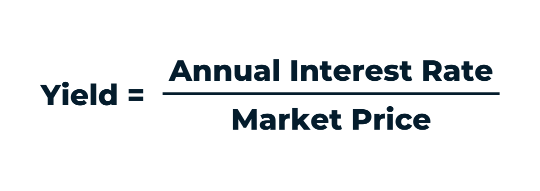
First, what is the yield curve, and why does it matter? Typically, when the yield curve appears in financial and economic news, it’s referencing the yield curve of United States Treasury securities. The “yield” on a bond or fixed income security is calculated as its annual interest rate divided by its current market price.

The yield tells an investor what kind of income they’re getting for each dollar they invest. It’s one of many useful measurements when evaluating which fixed income securities are a good fit for your portfolio. With that said, the yield curve is actually a plotted graph of yields based on varying maturities of bonds and can span from a near-term maturity such as a few days all the way to 100 years. The US Treasury publishes updated yield curves each day to help investors stay on top of the treasury security outlook. However, the yield curve is valuable for more than that – it’s also used as a predictive indicator of economic health. By observing the shape of the curve, economists and individuals alike can draw conclusions about where the US economy is headed.

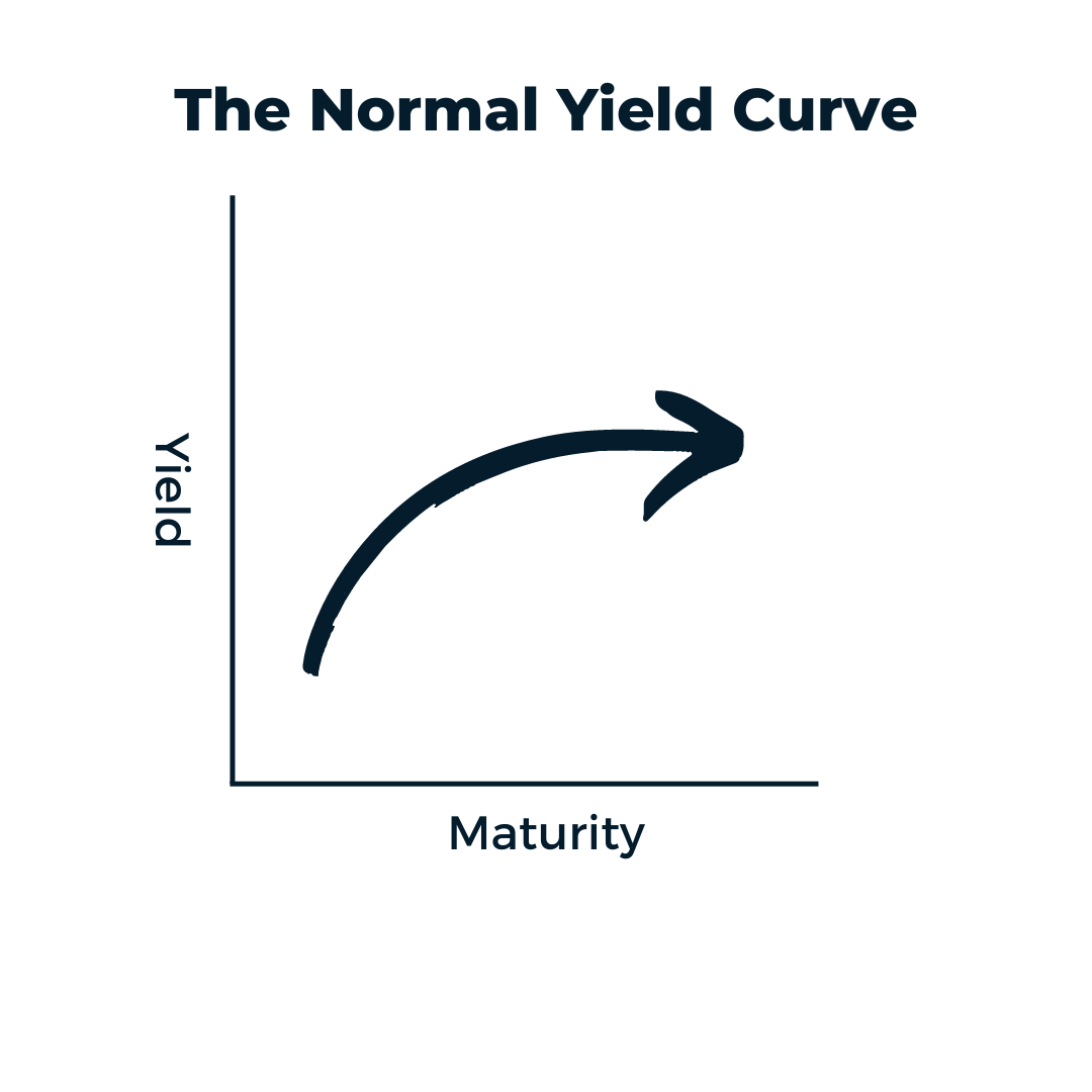
A Normal Curve
The “normal” curve depicts lower yields in the near term and higher yields for longer maturities. This implies that investors are rewarded proportionately for keeping their money invested longer. This is logical, since an investment of $1000 for 30 years should have a higher yield than investing for one year because the individual is forgoing other investment opportunities during that span of time. This shape of curve also indicates a generally healthy economy.

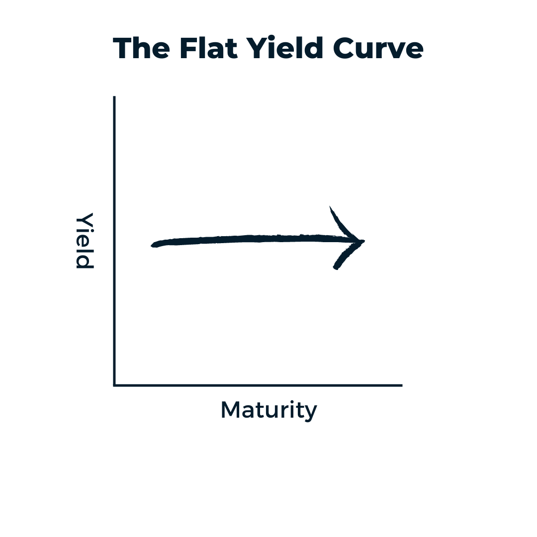
A Flat Curve
When the curve is flattened, investors can achieve a similar annual return when investing in the short term as they can in the long term. This can result from the Federal Reserve’s interest rate adjustments in the overnight rate. When it’s increased, it can prompt institutions to increase their short-term rates when they work with their clients – disincentivizing long-term borrowing in the larger economy. Basically, the flattening curve is a mild indicator of an oncoming bear market or recession.

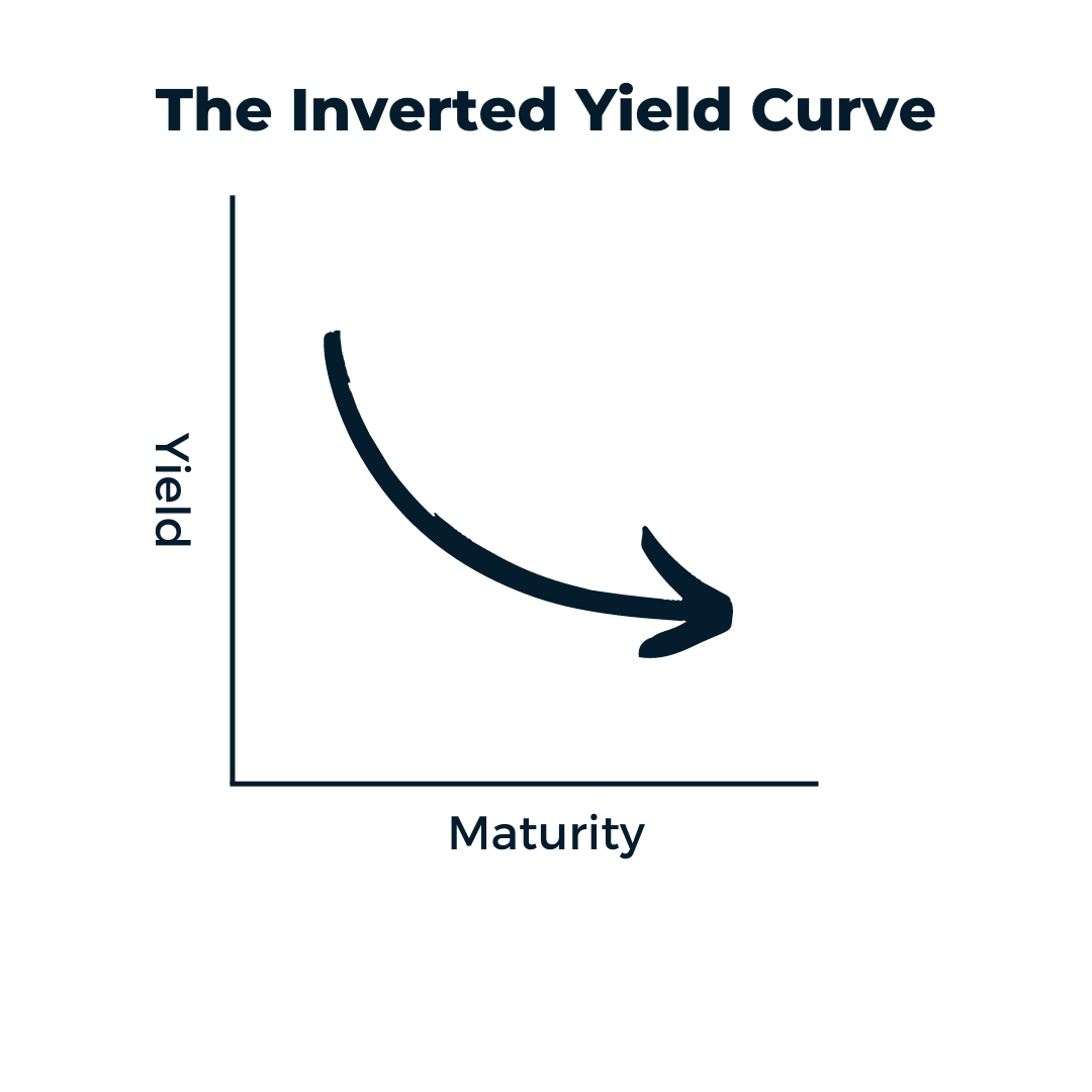
The Inverted Curve
The yield curve is considered “inverted” when long-term maturities yield less than those in the short term. This implies that the risk premium normally paid for a longer investment is now absent, and that overall investor sentiment is low. The inversion of the curve typically occurs when investors are concerned about equity markets, causing many to seek long-term treasury securities as a “safe” investment. Increased demand for these investments drives supply (and therefore yields) down, resulting in the inverted curve. The inversion also results from other factors, such as inflation, and while it’s been a long-standing recession indicator, an inverted yield curve isn’t the end-all be-all predictor of market performance.


